I want to paint my house, but I don’t know which paint to use! Can you help me decide?
There is a lot of confusion in the world of paint. I sometimes get questions on my YouTube channel making me realise that it’s not straight forward for most people and in this blog post I’m going to try to shed some light on it all.
There are many labels, but only a few manufacturers. There are also only a few ingredients in paints. A lot of it is marketing, some of it is bad advice from the sales assistant at the local DIY shop, and the rest is people hoping for the best.
The manufacturers
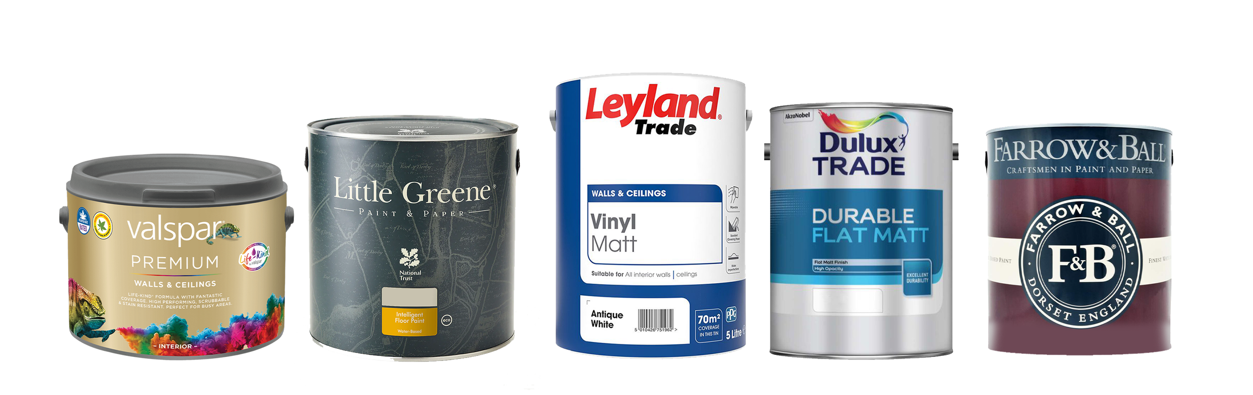
To start with, let’s talk about who makes the paint. Most of paint you can buy is made by PPG. That’s true for Dulux, Johnstone's, Leyland, Wilco and many more. The other brands are either independent like Little Greene or part of different manufacturer’s groups like Sherwin-Williams who makes Valspar amongst other paints. Some brands of course swap hands from time to time, but the recipes aren’t changed, mostly.
So in the UK, you will most likely buy a paint made by the same company.
What is paint made of?
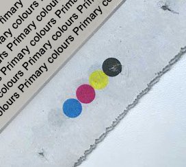
There are 3 products in paint: Pigment, solvent, binder.
The pigment is the colour of the paint
The solvent is what determines the family (Oil or Water) also turns a paste into a liquid.
The binder is the glue. What hold the paint together. For example gouache is just pigment and water, and it can be dissolved when dry.
Sometimes they also add other ingredients in the mix to achieve different results. For example masonry paint has added anti-mould agents to help against the elements. Side note, it should never be used indoors as it’s toxic for us.
Which is the safest to use?
Another misconception is that water-based paints are much better for us to use. The truth is that it depends on the application. Oil-based paints fumes are toxic far more than water-based paints, that’s true. BUT, the moment you use a paint sprayer it’s the opposite. We (humans) are water-based, and when we breath in the paint particles, (either by using water-based spray paint or water-based paints with an airbrush or a paint sprayer) those particles mix inside our bodies, unlike oil-based paints. Also if you use some water-based paints then store it for a year or more, if it’s emulsion you will have a strong mould smell coming from it, where oil-based paints will last for many years even with the lid off, as it will create its own skin.
So always use any types of paints in a well ventilated area, and use the correct protection for the application.
What makes paint different?
Why are some paint expensive, and some cheap? What’s the difference?…
the answer is: Pigment!
The pigment is the expensive part of the paint. Water is abundant, and the glue is also not too expensive in the case of water- based paints (they use some type of plastic glue, either PVA, Latex, acrylic or other polymer) resin however is more expensive, hence the higher price of eggshell, undercoat, gloss,…
So depending on the paint, it will have more or less water, and more or less pigment, and binder.
Sometimes you want a watered-down paint, example if you are painting the first coat over plaster, you either need to dilute the paint 50% with water or buy a paint that’s heavily diluted on purpose so it can penetrate the plaster. Failure to doing that, the paint will flake clean off in time, as your house gets cold, hot, cold, hot.
Some paint is also very diluted and sold cheap, but it’s best to stay away from those as you will need to apply 4 + 1 wet coats instead of 2 + 1 wet coat.
Some pigment is harder to produce, Magenta, red, emerald, and is therefore more expensive. At the art shop you will see the paint is sold as series from 1 to 7 (mostly) Magenta being series 7, and Black and White being series 1. But when it comes to house paints, it’s simpler for the shops like Leyland, B&Q, HomeDepo, Leroy Merlin, to sell the paint at the same price regardless of the colour. They just charge you more for a deep base (more pigment) than a pastel base (more chalk or similar)
So why do I need a lot of pigment in my paint?
In a lot of cases you can get away with a cheaper paint. If you are using a white, a grey or any pastel colour. Because the colour won’t fade, and if it does, it won’t be very noticeable.
If you are looking to use a bright colour or you’re going to have a south-facing wall with a lot of sun on it, you may decide to use a very strong paint like Little Greene that has a lot of pigment in their paint and will last a lot longer that your regular PPG-made mix. This comes at a premium, and it’s up to you to decide if it’s better to re-coat more often, or get a more expensive paint.
JARGON explained
Trade generally contains more pigment.
Tough or Diamond or hard-wearing it has more acrylic polymer or resin.
Emulsion, Vinyl matt, Latex are very similar, and to be used indoor. Though latex and vinyl are not water soluble, emulsion is.
One coat paint: lie. Unless you’re using tar, the mechanical process of painting requires 2 coats minimum.
Matt, gloss? Matt is the least shiny then satin, then semi gloss, then gloss. Please note, regardless of what the tin promises with some water-based paints, it will not be as glossy as oil-based paints. Similarly, an oil-based paint cannot be as as matt as a water-based paint because oil is shiny :-)
Which paints/brands I recommend, which one I don’t.
The paints I use partly depend on my clients and their budgets and needs. Also this is my opinion which has been formulated after years of using many products and brands, by painting for clients and myself in easy and harsh conditions, and by testing the paints in my studio, as well as doing online research. As of now I’m not sponsored by any brand, so this is an unbiased opinion. Should the day come when I’m sponsored by a brand or multiple brands, I will make sure to tell you and make it clear on my website.
My most used paint is Leyland trade. It is a strong paint, with good coverage, good pigments and affordable.
My personal favourite is Little Greene. It has the most amount of pigment, it’s strong and applies well, but very expensive.
My second go-to is Dulux trade. I personally can’t see a difference on the coverage or pigments compared to Leyland trade, but it’s more expensive. However it’s an internationally available paint, so I know what I’ll get wether painting for a client in the UK or New Zealand or Japan.
Valspar is another good quality paint, and their buckets are very user friendly!
We’ve done the good, now let’s do the weird…
I feel like F&B deserve a category of their own.
I have to give credit where credit is due, so I’ll start by saying Farrow and Ball water-based eggshell is very strong. BUT I do not recommend their emulsion at all. I once painted a bedroom 5 coats, and you could still see the filler patches through the paint. They say it has to be painted with 2 coats of their primer paint (similar to Dulux emulsion) before painting their emulsion, but then might as well skip their paint altogether. They are the Prada of paints, you pay for the branding and the R&D in finding good pastel shades. But as I said earlier, if you’re painting a pastel shade you can go cheap.
Then why use it?
So, the reason people like Farrow and Ball is the because of the ultra matt look. Sure you can match their colours with Leyland but it will have more sheen, even with a matt emulsion (not vinyl matt).
And the reason I don’t recommend it is because most contractors don’t know how to use it. It’s not that it’s a difficult paint to use, but it’s an unforgiving paint. unless you use it properly, it will show all the imperfections. Unlike their eggshell which is easy to apply.
What If I want to use it? how do I use it?
I think this blog is long enough, and it’s almost 3pm and I haven’t had lunch, So check in next week Friday for a step by step on how to paint with any paint and get great result.
Thanks for reading,
Olivier.